
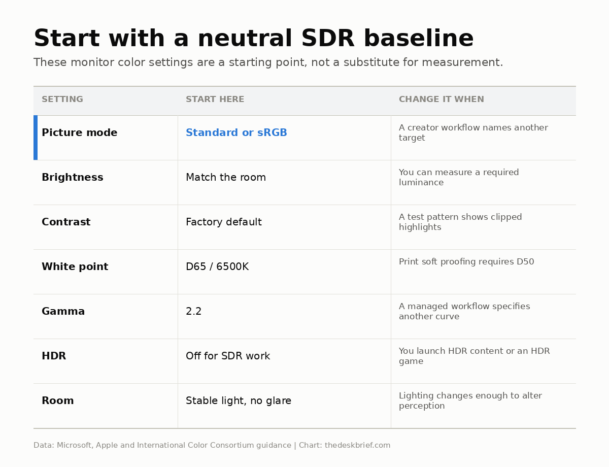
Monitor color settings are easy to make worse because every menu offers a dozen controls and only a few of them solve a real problem. The useful baseline is boring: choose a neutral picture mode, match brightness to the room, leave contrast near its default, use a sensible white point and gamma, and keep HDR out of the way until you are actually viewing HDR.
That is enough for office work, web browsing, and most gaming. It is also honest about the limit: you can make a screen look natural by eye, but you cannot verify colour accuracy by staring harder. A colorimeter is the only dependable way to calibrate because calibration is measurement, not taste. Most people do not need one.
Table of Contents
- Monitor color settings: the five-minute reset
- The best baseline for office work
- Content creation needs measurement
- Gaming and HDR need a separate preset
- Eyeballing versus hardware calibration
- Mistakes that make monitor colour worse
- Frequently asked questions
- The Short Version
Monitor color settings: the five-minute reset
Start by resetting the display, then select Standard, Custom, or sRGB. Avoid Vivid, Dynamic, Cinema, Reading, Eye Saver, and game-specific colour filters while you establish the baseline. Those modes are effects. Some are useful later, but they should not be the foundation.
Set the monitor at the height and angle you actually use before judging the image. A tilted panel, glare, or a screen viewed off-axis can change the picture enough to make menu adjustments pointless. My guide to correct monitor height covers the physical setup, while the monitor arm versus stand comparison explains when positioning hardware earns its desk space.
Now turn off dynamic contrast, black enhancement, automatic colour temperature, ambient picture processing, and content-adaptive brightness. Microsoft specifically warns that content-adaptive brightness can be distracting in photo and video apps where colour accuracy matters. On an external Windows monitor, brightness is usually changed with the display’s own buttons rather than the Windows slider.
Finally, lower brightness until white pages look like white paper in the room, not a lamp pointed at you. Do this with the room lighting you normally use. If the screen looks dim only because a window is reflected in it, fix the reflection before driving the backlight harder.
The best baseline for office work
For documents, spreadsheets, email, and the web, the best monitor color settings prioritize consistency over spectacle. Use the Standard or sRGB preset, set colour temperature to 6500K or Normal, leave gamma at 2.2, and keep contrast at its factory default unless a clipping pattern gives you a reason to move it.
Brightness has no universal percentage because 30 percent on one monitor can be brighter than 70 percent on another. Match it to the room by eye. A useful test is to open a blank document beside a sheet of ordinary white paper. The display should not look dramatically brighter than the paper under the same light.
Do not chase perfect blacks by crushing shadow detail. Black Stabilizer, Shadow Boost, and similar controls are visibility tools for games, not accuracy controls. The same applies to sharpness: the neutral point is often the centre or factory default, not zero. Excess sharpening adds pale halos around text.
A monitor built for office work may expose fewer controls than a gaming display, which is not automatically a problem. The gaming monitor versus office monitor guide separates the settings that matter from the features that mainly raise the price. The Samsung ViewFinity S80HF analysis is a useful example of an office display whose value rests more on resolution and connectivity than endless picture modes.
Content creation needs measurement
If you edit photos or video for clients, the job changes. Eyeballing can make the screen pleasant, but it cannot tell you whether white is truly D65, gamma follows 2.2, or luminance has reached a measured target. The International Color Consortium describes calibration and profiling as a pair: first the display is brought to a defined behaviour, then an ICC profile tells colour-managed software how that specific display behaves.
The ICC’s display calibration guidance gives 160 cd/m², D65, and gamma 2.2 as an Adobe RGB reference example. That is not a magic target for every room. It is a measured workflow target, and the room still matters. Print soft proofing can instead call for D50. Use the target required by the work, not whichever preset looks richest.
Let the monitor warm up, keep room lighting stable, prevent direct light from falling on the panel, and run the colorimeter software. The ICC suggests roughly 15 minutes of warm-up and says factory contrast is often the best starting point. Save the generated profile and make sure the operating system assigns it to the correct display.
Do not download a random ICC file for the same model and call the job finished. A profile characterizes an individual display in a particular state. Panel variation, age, brightness, and room conditions can make somebody else’s profile a poor fit. Use the manufacturer’s profile as a fallback, not as proof that your unit is calibrated.
Gaming and HDR need a separate preset
Gaming benefits from a neutral SDR preset too, but competitive visibility and HDR are separate jobs. Keep your everyday preset clean, then save a second game preset if you want more shadow lift or saturation. That prevents a Black Equalizer setting from making every photograph and web page look washed out the next morning.
Leave HDR off while adjusting ordinary SDR content. HDR changes the brightness and tone-mapping rules, so mixing the two workflows makes comparison unreliable. On Windows, Microsoft directs HDR-capable external displays to the Windows HDR Calibration app. Run that process for HDR, then return to your neutral preset for normal desktop use.
Wide-gamut gaming monitors can also oversaturate ordinary sRGB content when colour management is weak or disabled. An sRGB clamp or sRGB picture mode is the practical fix. If the clamp locks brightness at an uncomfortable level, use a custom mode and accept that it is a visual compromise rather than measured accuracy.
Eyeballing versus hardware calibration
Eyeballing is good enough when the goal is comfort and a believable picture on one screen. You can catch obvious blue or yellow casts, clipped whites, crushed blacks, excessive brightness, and cartoonish saturation. Free test patterns help because they replace memory with visible reference steps.
Windows can create a display profile through its built-in calibration path, and Microsoft documents the colour profile controls under Settings, System, Display, Color profile. The wizard is useful for correcting a bad setup, but your eyes are still the measuring instrument.
Apple makes the sensible consumer case directly: its Mac display calibration guidance says calibration usually is not necessary in a typical home or office environment. The assistant can create and assign a profile, but Apple also points out that ambient light, viewing angle, and display age affect what you see.
Buy or borrow a colorimeter when colour has to match another display, a printer, a client reference, or a delivery standard. It also makes sense when two monitors beside each other refuse to agree. If you are just trying to make a budget screen look normal, spend the money on the better monitor first. My 27-inch monitor under CA$300 guide explains where cheaper displays make the compromises that settings cannot repair.
Mistakes that make monitor colour worse
The most common mistake is adjusting every control at once. Change one item, look at a familiar photograph plus a greyscale and clipping pattern, and keep notes. If you cannot explain what improved, put the control back.
- Using Vivid as a neutral mode: it usually pushes saturation, contrast, or both.
- Setting contrast by preference: excessive contrast clips bright detail even when the image looks punchy.
- Running Night Light during colour work: warmer white is useful at night but invalidates colour judgements.
- Calibrating in daylight, editing at night: a changing room changes your perception of the same screen.
- Copying somebody else’s RGB gains: units vary, so another owner’s red, green, and blue values are not a measurement of yours.
- Leaving HDR on for everything: SDR desktop content can look inconsistent when the HDR path and app support disagree.
The reset button is not defeat. If the screen becomes harder to read or familiar images look stranger after an hour of tweaking, return to Standard or sRGB and make only the brightness adjustment. A restrained setup beats an elaborate wrong one.
Frequently asked questions
What are the best monitor color settings for most people?
Start with Standard or sRGB, set 6500K or Normal white balance, gamma 2.2, factory contrast, and brightness matched to the room. Disable dynamic contrast and adaptive picture processing. Keep HDR off for ordinary SDR desktop work.
Should contrast be set to 100 percent?
No. A high contrast setting can clip bright shades into the same white block. The factory default is a safer starting point, then use a clipping pattern if you need to verify it.
Is 6500K always the correct colour temperature?
D65, roughly 6500K, is the common digital baseline, but a managed print workflow can specify D50 and some video work uses other standards. For general office use, choose Normal or 6500K and avoid Cool or Vivid.
Do I need a colorimeter for gaming?
Usually not. A neutral preset and test patterns are enough for most gaming. A colorimeter becomes useful when you also create paid visual work, need multiple screens to match, or care about measured accuracy rather than preference.
The Short Version
Reset the monitor, select Standard or sRGB, turn off dynamic picture processing, match brightness to the room, leave contrast near default, choose D65 or 6500K, and use gamma 2.2. Treat HDR and competitive game visibility as separate presets. These monitor color settings will get most desks close enough without turning setup into a weekend project.
If colour accuracy affects money, approvals, print, or delivery standards, stop eyeballing and use a colorimeter. For everyone else, the honest finish line is a screen that looks natural in the room where it is actually used.